Specialized Graph Types | ||||
|
| |||
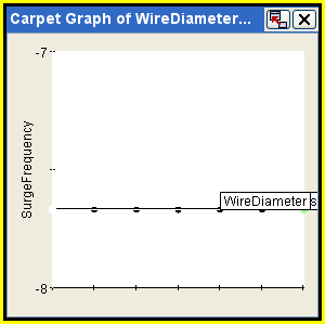
Carpet Graphs
A carpet graph illustrates the interaction of two independent variables. Because carpet graphs require a well structured data set (uniform grid of all combinations of all values for two inputs), they are available through the Graphs tab in the Runtime Gateway only if the corresponding DOE component uses the Full Factorial DOE technique with exactly two defined factors.
If your DOE component uses a data set that is not well structured, you can still access the carpet graph functionality using the View Carpet Graphs option, which is available directly from the Design Gateway prior to model execution (see Creating Carpet Graphs Prior to Model Execution) or after model execution through the Runtime Gateway (see Creating Carpet Graphs). In addition, you can create carpet graphs for any component (even non-DOE components) directly from the Isight Design Gateway prior to model execution.
The following figure shows an example of a carpet graph:
![]()
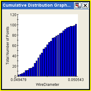
Cumulative Distribution Graphs
A cumulative distribution graph shows the cumulative distribution for the specified random variables and/or responses. Cumulative distribution graphs are available only for Monte Carlo components. To create a cumulative distribution graph, see Creating Graphs for Components.
The following figure shows an example of a cumulative distribution graph:
![]()
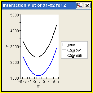
Interaction Graphs
An interaction graph shows the main effect of a selected factor on a response at each level of another factor. Interaction graphs are available only for DOE components. Lines that are parallel indicate that the two factors have no interaction affect on the response (the less parallel, the greater the interaction). To create an interaction graph, see Creating Graphs for Components.
The following figure shows an example of a DOE interaction graph:
![]()
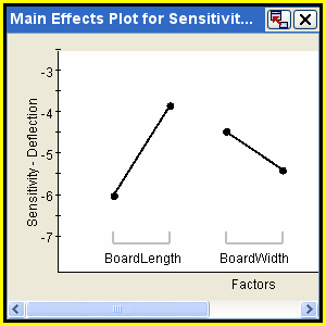
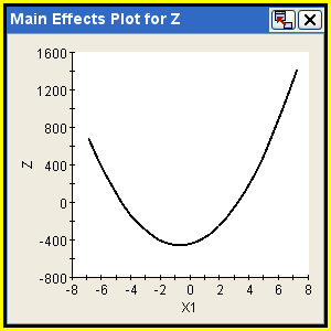
Main Effects Graphs
A main effects graph shows the effect of a factor or set of factors on a response by plotting the relationship as determined by the data set’s regression analysis. Main effects graphs are available only for DOE components. (The Taguchi component provides a slightly different Main Effects Graph of its own, described later in this section.) You can choose a continuous or piecewise fit type. A continuous fit type generates smooth curves by evaluating the polynomial from the regression fit at numerous points across the range of a factor. A piecewise fit type plots distinct segments joining only the evaluated points at the exact levels at which the factor was studied. To create a main effects graph, see Creating a DOE Main Effects Graph.
The following figure shows an example of a DOE main effects graph:
![]()
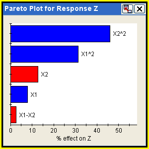
Pareto Plots
A pareto plot shows the relative effects of the factors on a response as determined by the data set’s regression analysis. Pareto plots are available for DOE, Monte Carlo, and Six Sigma components (see Creating Pareto Graphs). It is an ordered bar chart that displays the effects of each factor on a selected response, where the factors are listed in order of largest effect to smallest effect. Blue bars indicate positive effects on responses, while red bars indicate negative effects. Therefore, this plot can be used to identify the factors with the most significant effects on, or largest contribution, to the responses.
When the Reliability Analysis technique is used in Six Sigma analysis, the random variable effects shown in the pareto plot are based on the gradients of the random variables with respect to the selected response. For Monte Carlo simulation and Design of Experiments, the relationship is determined by regression analysis of the Six Sigma data set.
The ranking of effects presented in the Pareto plot is determined by ordering the scaled and normalized coefficients of a standard least-squares second-order polynomial fit to the component’s data. If sufficient data are available—at least (N + 1)(N + 2)/2 points, where N is the number of inputs—and each input has at least three distinct levels/values, a full second-order polynomial model, including all two-way interactions, is fit to the data. The minimum number of points required is (N + 1), resulting in a linear polynomial fit. If the number of data points is between (N + 1) and (N + 1)(N + 2)/2, a partial second-order polynomial is constructed (quadratic, two-way interaction terms added until no degrees of freedom remain).
Before fitting the polynomial model, the input data are first scaled to range from –1 to 1 and the least squares fit is performed on this data. The scaling is performed so that the contributions can be compared more fairly because both the magnitude of the factors and the amount they were varied affect the data used in constructing the response surface model. The model coefficients resulting from the least squares regression applied to the scaled data are normalized by summing the coefficients and dividing each coefficient by this sum of all coefficients.
The following figure shows an example of a pareto plot:
![]()
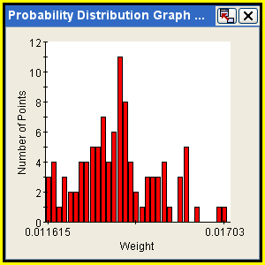
Probability Distribution Graphs
A probability distribution graph shows the probability distribution for the specified random variables and/or responses. Probability distribution graphs are available only for Monte Carlo components. To create a probability distribution graph, see Creating Graphs for Components.
The following figure shows an example of the Monte Carlo probability distribution graph:
![]()
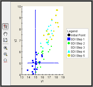
SDI Scatter Plots
An SDI scatter plot is a two-dimensional graph (see 2D Scatter Plot Graphs) using two parameters with no lines connecting the values. Each SDI iteration is shown in a different color. SDI scatter plots are available only for SDI components. To create an SDI scatter plot, see Creating Graphs for Components.
The following figure shows an example of an SDI scatter plot:
![]()
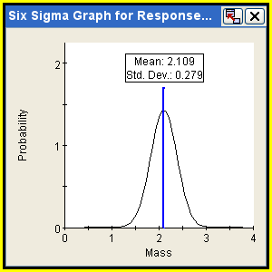
Six Sigma Graphs
A Six Sigma graph displays a normal distribution for selected responses. Six Sigma graphs are available only for Six Sigma components. This distribution is generated using the calculated mean and standard deviation values for this response and displays the lower and/or upper bound values, the number of standard deviations between the bounds and the mean value (if the response has bounds defined), and the total quality level. Although you can create a Six Sigma graph prior to model execution (see Creating Graphs and Tables Prior to Model Execution), the graph will be empty; it is updated only after model execution. To create a Six Sigma graph, see Creating Graphs for Components.
Note: The quality level is calculated using the normal distribution and the bound positions, unless Monte Carlo sampling is used. For Six Sigma analysis using Monte Carlo sampling, the probability of failure is determined as the ratio of the number of failed sample points to the total number of samples, and the quality level is determined from this probability of failure. If no points are sampled outside the bounds, the graph may show the distribution tail outside the constraint boundary. In this case the probability of failure is zero, and the quality level cannot be calculated (reported as in this case).
The following figure shows an example of a Six Sigma graph:
![]()
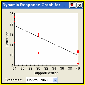
Taguchi Dynamic Response Graphs
A Taguchi dynamic response graph applies to a single selected dynamic response and to a single design point. Taguchi Dynamic Response graphs are available only for Taguchi Robust Design components. The design point can be a control experiment, the baseline point (if included in the component configuration), or the determined best or worst levels for a given Taguchi metric (S/N ratio, Sensitivity, etc.). The design points corresponding to the best or worst levels are available if confirmation runs were selected in the component configuration or if the best or worst levels are identical to one of the control runs. To create a Taguchi dynamic response graph, see Creating a Taguchi Dynamic Response Graph.
The following figure shows an example of a Taguchi Dynamic Response graph:
![]()
Taguchi Main Effects Graphs
A Taguchi main effects graph displays the average effect on the selected response of each factor level for each factor selected and for the Taguchi metric selected. Taguchi main effects graphs are available only for the Taguchi Robust Design component. In addition to viewing main effects data graphically, you can also view main effects data interactively as described in Using the Taguchi Main Effects Viewer. To create a Taguchi main effects graph, see Creating a Taguchi Main Effects Graph.
Note: The History tab in the Runtime Gateway shows the number of rows based on the number of times the component was executed. For the Taguchi Robust Design component the History tab includes extra component run number columns to display the signal experiment number, control experiment number, and the noise experiment number.
The following figure shows an example of a Taguchi Main Effects graph: