Standard Graph Types | ||||
|
| |||
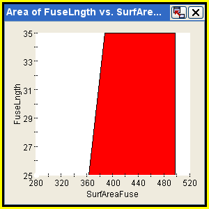
Area Graphs
An area graph is a two-dimensional graph using two or more parameters that plot one X-value against one or more Y-values. To create an area graph, see Creating Graphs for Components.
The following figure shows an example of an area graph:
![]()
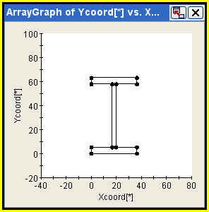
Array Graphs
An array graph is a two-dimensional graph using array parameters. With an array graph, you can plot multiple combinations of the following:
-
Two one-dimensional arrays against each other
-
A one-dimensional array against its own indices
-
The two slices of a array against each other
The slices of different two-dimensional arrays against each other
To create an array graph, see Creating Graphs for Components.
The following figure shows an example of an array graph:
![]()
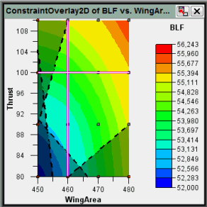
2D Overlay Constraint Graphs
A 2D overlay constraint graph is a contour graph that shows color-coded isosurfaces or isobars for three parameters. It also overlays any known constrained parameters and shades the infeasible regions. To create a 2D overlay constraint graph, see Creating Graphs for Components.
The following figure shows an example of a 2D overlay constraint graph:
![]()
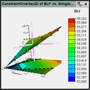
3D Overlay Constraint Graphs
A 3D overlay constraint graph is a surface graph that shows the topology relationship between three parameters. To create a 3D overlay constraint graph, see Creating Graphs for Components.
The following figure shows an example of a 3D overlay constraint graph:
![]()
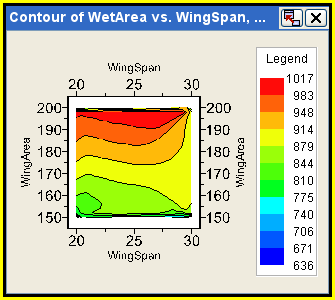
Contour Graphs
A contour graph is a two-dimensional graph displaying the relationship of two parameters against a third parameter, presenting regions of values with a certain range. Contour graphs display color coded isosurfaces or isobars. To create a contour graph, see Creating Graphs for Components.
The following figure shows an example of a contour graph:
![]()
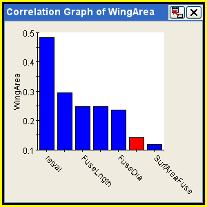
Correlation Graphs
A correlation graph is a bar graph that represents the correlation value of another parameter to the selected parameter. A correlation graph provides a quick look at the most influential/influenced parameters surrounding the selected parameter. You can use correlation tables to view the correlation values between selected output parameters and selected input parameters (see Using Correlation Tables). To create a correlation graph, see Creating Graphs for Components.
The following figure shows an example of a correlation graph:
![]()
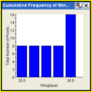
Cumulative Frequency Graphs
A cumulative frequency graph analyzes one parameter over its range and calculates a cumulative frequency distribution. The value is similar to the cumulative probability except that there is no guarantee that the data represent the probability distribution. To create a cumulative frequency graph, see Creating Graphs for Components.
The following figure shows an example of a cumulative frequency graph:
![]()
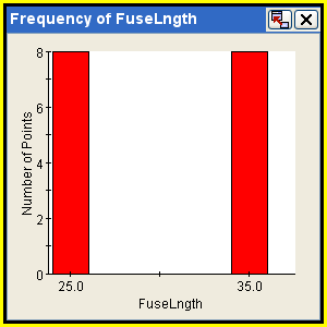
Frequency Graphs
A frequency graph analyzes one parameter over its range and divides the range into frequency bars. The value is similar to the probability except that there is no guarantee that the data represent the probability distribution. To create a frequency graph, see Creating Graphs for Components.
The following figure shows an example of a frequency graph:
![]()
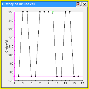
History Graphs
A history graph displays a parameter’s value as a function of the run number for a selected component. The X-axis displays the run number, and the Y-axis displays the parameter value for each run in the order the runs were executed. To create a history graph, see Creating Graphs for Components.
The following figure shows an example of a history graph:
![]()
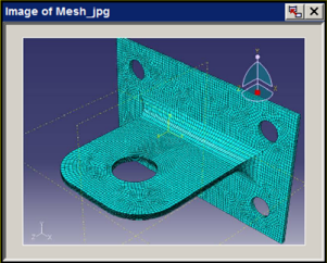
Image Graphs
An image graph allows you to view file parameters that contain .gif, .jpg, .jpeg, or .png files. You can view models that produce image files that represent the design in the Runtime Gateway. To create an image graph, see Creating Graphs for Components.
The following figure shows an example of an image graph:
![]()
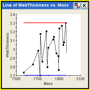
Line Graphs
A line graph is a two-dimensional graph using two or more parameters. Line graphs plot one X-value against one or more Y-values. To create a line graph, see Creating Graphs for Components.
The following figure shows an example of a line graph:
![]()
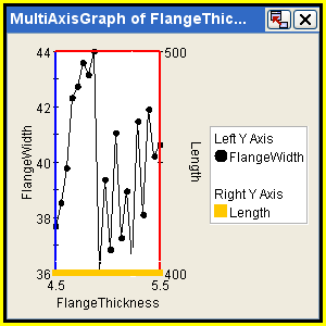
Multi Axis Graphs
A multi axis graph is a 2D line graph that plots one X-axis value against one or more Y-axis values. The Y-axis can have multiple visible axes lines on the right or left side of the graph. To create a multi axis graph, see Creating Graphs for Components.
The following figure shows an example of a multi axis graph:
![]()
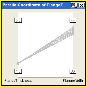
Parallel Coordinate Graphs
A parallel coordinate graph uses one or more parameters. Along the X-axis each variable is assigned a position, and each value of that parameter is displayed on a logic axis above that point. Along the Y-axis the values of a given run are strung together with a line connecting all the dots above each parameter value. To create a parallel coordinate graph, see Creating Graphs for Components.
The following figure shows an example of a parallel coordinate graph:
![]()
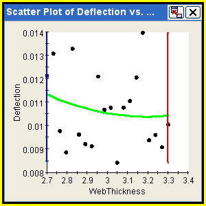
2D Scatter Plot Graphs
A 2D scatter plot graph shows two or more parameters with no connecting lines. If you are creating a 2D scatter plot graph, you can use trend lines (also known as regression lines) to help determine the strength of the relationship between two parameters. Trend lines can be fit using quadratic or linear fitting. You can also evaluate the strength of the relationship between two parameters by examining the R2 value of the fit. The R2 value is a value between 0 and 1, with a higher magnitude value suggesting a stronger relationship. To create 2D scatter plot graphs, see Creating 2D and 3D Scatter Plots.
The following figure shows an example of a 2D scatter plot graph:
![]()
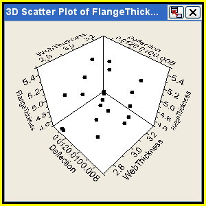
3D Scatter Plot Graphs
A 3D scatter plot graph shows three or more parameters with no connecting lines. To create 3D scatter plot graphs, see Creating 2D and 3D Scatter Plots.
The following figure shows an example of a 3D scatter plot graph:
![]()
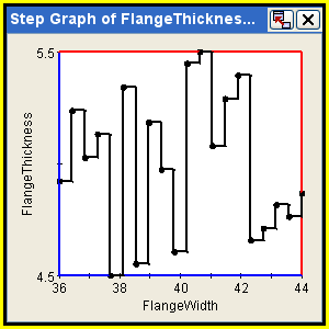
Step Graphs
A step graph is a two-dimensional graph using two or more parameters that plots one X-value against one or more Y-values. Step graphs are similar to line graphs; however, the plotted points are connected by stepped lines instead of by straight lines. The stepped lines indicate that the graph is not attempting to display any information about the data that fall between the plotted points. To create a step graph, see Creating Graphs for Components.
The following figure shows an example of a step graph:
![]()
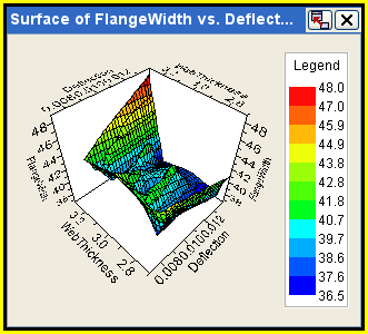
Surface Graphs
A surface graph is a three-dimensional graph using three parameters that shows the topology relationship between the selected parameters. To create a surface graph, see Creating Graphs for Components.
The following figure shows an example of a surface graph:
![]()
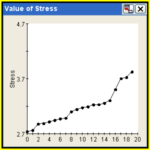
Value Graphs
A value graph shows the Y-axis as the value of one or more parameters, while the X-axis displays a value’s rank in the overall group of values. The values are sorted in order of increasing value and show the distribution of the sampling over a range. To create a value graph, see Creating Graphs for Components.
The following figure shows an example of a value graph: